Designing a picture book is a skill not everybody has. Online printers such as Amazon and Ingramsparks have special programs to make your life easier. However, a beginner is often at a loss. This wasn’t what you had in mind when you wanted to write a picture book. That’s why I’m sharing a few tips that might make your publishing process a bit easier and less stressful.
Size matters
When making a picture book, choosing the format of the book, is something you have to decide at the beginning of the process. Illustrators need to know what size the illustrations should be. When self-publishing at Amazon, or Ingramsparks you can only choose from their suggested book sizes. At a printer you can choose your own size, but for that you definitely need more budget.
How to choose the right size
If you have no idea what format to choose, visit your local library. In the children’s section you will find many different formats. Grab some different books and see how it feels, how it looks, how it fits in your hand. The choice also depends on the age category, the type of book and the story. Perhaps a vertical format works better with the story you have written than a horizontal format. I’ve always been a big fan of a square format myself, but that’s only because a square format strikes me as a balance, it’s a personal preference.
Storyboard
After you’ve chosen the perfect format, you are going to create a storyboard. Draw 32 squares on a piece of paper. Each box stand for a page. A standard picture book has 32 pages. By using a storyboard, you can see per page how text and illustration will look on each page. By making a storyboard you can easily check whether the story and illustrations flow smoothly over the pages. When you have set up the storyboard properly from start, it saves a lot of time and frustration at a later stage.
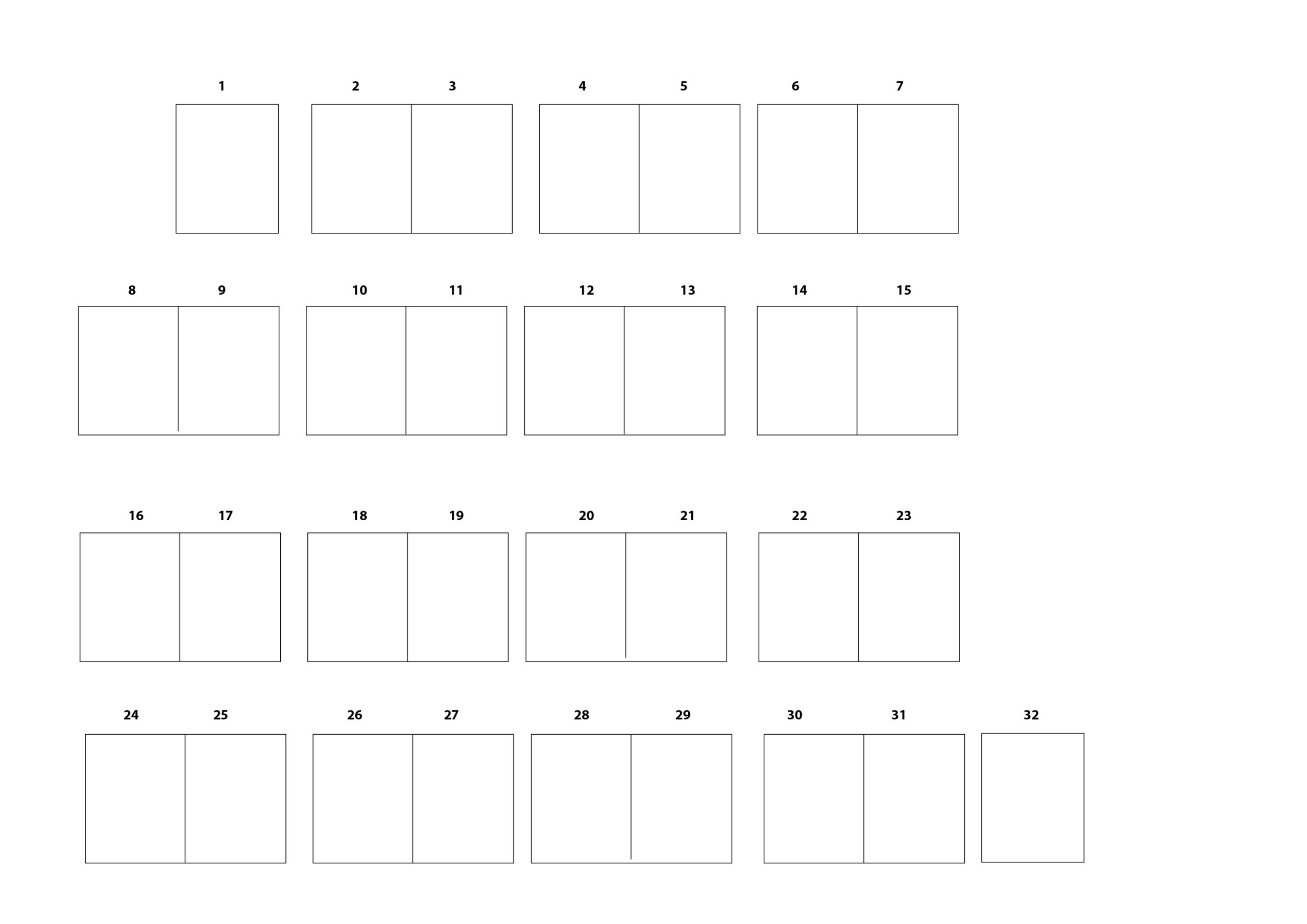 Download here your storyboard.
Font choice
When you’ve done all these steps, the next step is the font choice. Choosing the right font can be difficult too. Which font suits the story, how big should it be and what should be the line spacing? A serif font reads better than a sans serif, but is mostly used in novels. Good serif fonts are for example: Arno Pro, Palatino Linotype, Book Antiqua, Georgia, Goudy Old Style, Adobe Garamond Pro, Bookman, Century Schoolbook.
A more playful font is often chosen for a picture book, such as the Sassoon Primary or Tuffy Infant.
To make the story flow fluently in the book, the illustrations and the text should work perfectly together. A good children’s book illustrator knows, the illustrations should complement the story rather than repeat what the text says. It is very important that the illustrations have a high resolution of at least 300dpi and are made in CMYK, making them suitable for printing. A good book illustrator should know how to meet these requirements.
Last step
Now all the elements; the story, illustrations, and fonts come together, your book design is finally coming to an end. Before you upload everything to Amazon or send it to a printer, first make a dummy of your book to check the final result. Are you completely satisfied? Create two documents; a document for the cover and a document for the content. The final product is two certified PDFs with three millimeter bleed. You can now upload the book or send it to the printer.
Not quite sure about the steps? Ask me for help! I would be happy to help you with illustrations or the design of your picture book!
![]()